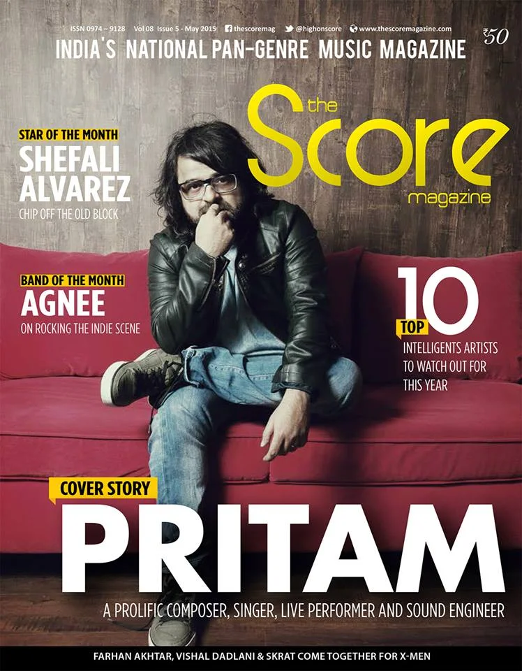
Making the shot: Pritam Chakraborty for Score magazine.
Early in April this year, I got a call from Score magazine, a music-centric publication based in Chennai that exclusively features Indian artists. They were looking to do a story on Pritam for their May cover story. In case you haven't heard of him (I was only vaguely aware of him since I apparently live under a rock or something), he's a fairly big name in the Bollywood music industry.
Anyway, Score describe themselves as "the first, only, fully comprehensive, national, indigenous Indian Music magazine". They seem to hold up to that description for the most part: Rock Street Journal was probably the first Indian music magazine, although they're not pan-genre.
A few short emails and phone conversations later, we had a shoot scheduled via Pritam's PR agency at his recording studio.
May 2015 Score magazine cover.
Editorial portrait photography throws you many wildcards. Some shoots go according to plan (for the most part), while others require some "duct-taping". Still others are more to the tune of you-have-no-idea-of-what-to-expect. Somehow, I seem to always find the shoots that fit that last description.
What makes editorial photography more challenging is the tighter budget that magazines tend to have compared to commercial productions. It entails travelling light, shooting quickly, and being cognisant about where and how the photos are going to end up, way before you hit the shutter release.
But that's also what makes them fun and exciting.
A print magazine cover will mean that you're working within a few constraints:
- The resultant photograph needs negative space that allows for copy. The composition needs to accommodate the title and copy about stories within the mag. The image above serves as an example, as does any magazine cover, really.
- One has to compose with vertical or 'portrait' layout in mind. Dimensions of magazines can vary, but this is a commonality among most, if not all. Any exceptions are few and far in between.
- For this particular shoot, the magazine wanted full-length photos. They didn't say why, but that was a prerequisite. These are always a little harder to do than say, headshots. Not only do you have to worry about body language and coach/goad your subjects when posing, you also have to break through the defensive barrier people put up when in front of a camera. This can be easy enough with light conversation, but people are doubly conscious in front of the camera when you're taking a full length portrait. Headshots, in comparison, are a breeze.
Preparation and lighting gear
The first, most obvious prep is to do your homework about the magazine and its cover layout.
This will at least partially drive creative decisions that govern composition. How much headroom? How much space at the bottom? Wide angle or tele?
The mood of the story and the magazine are also considerations, but they weren't really discussed in this instance.
On the day before the shoot, I usually call all parties involved to confirm that the shoot is still on, and create a checklist for all the gear that I'll be carrying with me.
As for the gear itself, big surprise: I tend to carry what the budget and the shoot call for. Neither the PR agency nor the magazine said how much time I'd have for the shoot, so gear decisions would have had to be based on the assumption that I'd have 15 minutes, tops.
In other words, the lighter, the better: other than the camera and lenses, one flashgun, one modifier and one stand. I always check and see if everything's working properly before I leave.
Some shoots don't require the kitchen sink.
- A: Digitek wireless radio trigger/transmitter for the flash, on camera hotshoe. There are now a variety of brands that perform the same function. Yesteryear, the only two that were reliable were PocketWizards and Cactus triggers, but I'm pretty happy with the range and reliability of this device.
- B: Nikon SB-24 flashgun, with a spare set of batteries. This is my go-to flash for quick editorial shoots. It's seen some wear over the last few years. Poor flashy's taken a few falls.
- C: Digitek receiver that is paired with the flash
- D: Flash umbrella bracket. Sits atop a stand (not pictured)
- F: An Elinchrom silver reflective umbrella. I like these way better than the shoot-throughs. They're "punchier", i.e. they're more contrasty, don't create hotspots in the middle of the beam, and cause less light spill.
- Other than what is pictured above, I had a camera bag (a Lowepro Compact AW) packed with a D90, 18-200mm/3.5-5.6, 50mm/1.8, a Tamron 90mm/2.8, a light meter for measuring ambient light and flash output, and 2 sets of 4x AA batteries.
Making the photograph
I arrived early so that I'd have time to quickly set up my flash, scope the place out, and take a few test shots. The office had a very noticeable red sofa that I decided to stop and stare at for a minute. I'd hoped that the recording studio would be more photogenic.
It wasn't.This, for instance was the vocals booth in the recording studio.
Ugh.
Not much you can do here, really. A tiny room that can barely fit three people isn't exactly conducive to making good photos. I'm sure it works fine as a studio, but it doesn't do me any good as a photographer, especially when the magazine is looking for full-length portraits.
The slightly larger mixing room was an option, but it was occupied and people were in the middle of an edit, so that was out until they were finished.
I was finally ushered back into the office with the red couch, where I immediately started setting up. That was going to have to be the location.
Window light was nice and soft, but there just wasn't enough of it: at 1/8th of a second, f3.5 and ISO 2000, even the slightest movement by Pritam was going to result in some serious motion blur.
To illustrate, I'd taken a few frames illuminated only with window light just to see what it was doing (answer: not good things), and here's what I got:
1/8, f3.5, ISO 2000. Noise and shake aren't good companions.
But I'm getting a little ahead of myself. The photo above was taken after I'd finished taking the cover shot.
I wanted to emulate the window light, but I wasn't particularly keen on creating the split-lighting results the window was creating.
The solution was simple. Umbrella emulating window light. Like so:
Flashgun with a reflective umbrella, emulating window light.
Oh yeah. Muuuuuch better. at 1/4th power with the SB-24, I'd effectively gained 8-odd stops: the exposure was now 1/200th, f6.3, ISO 200.
Out, damned spot shake!
I could've had a softer light source like a shoot through umbrella, but I still prefer the silver to the flat look that white umbrellas give you. I rarely carry them to portrait shoots because they spread light everywhere. In a large room this isn't a problem, but Mumbai has tin-can sized apartments, so light from a white/transluscent/shoot-through bounces off everything. And that makes every wall in a room a secondary, tertiary and quaternary light source. Flat. Booooring.
Initially, I'd imagined shooting Pritam at the far end of the couch while keeping the angle somewhat similar to the above photograph, but closer to his eye-level.
I was about to ask one of the ladies from the PR agency to be my stand-in model to check what the light was looking like when he walked in.
One advantage of working with somebody who's famous and has been the subject of many-a-shoot is that they always have several changes available. Pritam was no exception; he brought a small suitcase full of clothes with him.
We quickly went through some of his options and I picked the blue T-shirt and leather jacket as I thought it'd pop against the red. Harmonious primary colours and whatnot.
But as it turned out, the end-of-the-couch idea wasn't going to cut it:
Mmk. Kinda works.
Light? Check. Looking good. Negative space? Check. Everything else? Not so much. It's not a bad shot, but somehow doesn't really say "cover". Plus, I really didn't like the break in the background being right behind his head. That had to go.
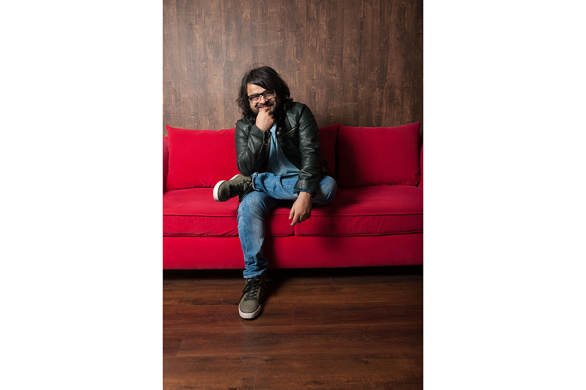
So, yeah. Less is more: I had him move right into the middle of the sofa, and finally ended up with these:
I probably would've gone with the "smiley" shot, since Pritam is a sociable person, but the magazine chose the first one. They also muted the reds and evened out the skin tone.
But that's a cover shot all right :).


